
Political Campaign Flyer
CLIENT: Sharon Quirk-Silva Campaign
ROLE: Graphic Designer
PROJECT OVERVIEW: Designed a campaign flyer for a California State Assembly candidate to promote a local community event and increase voter engagement. Create a clear, visually engaging piece that communicates event details while building trust with a broad audience of constituents.
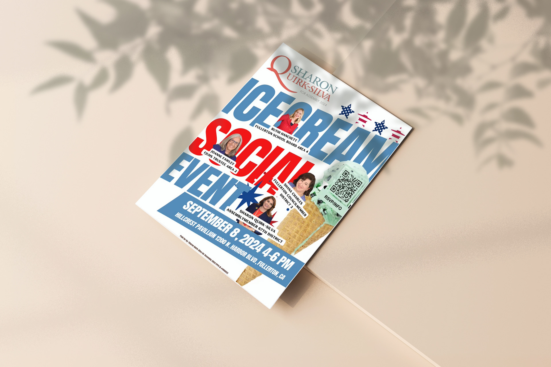
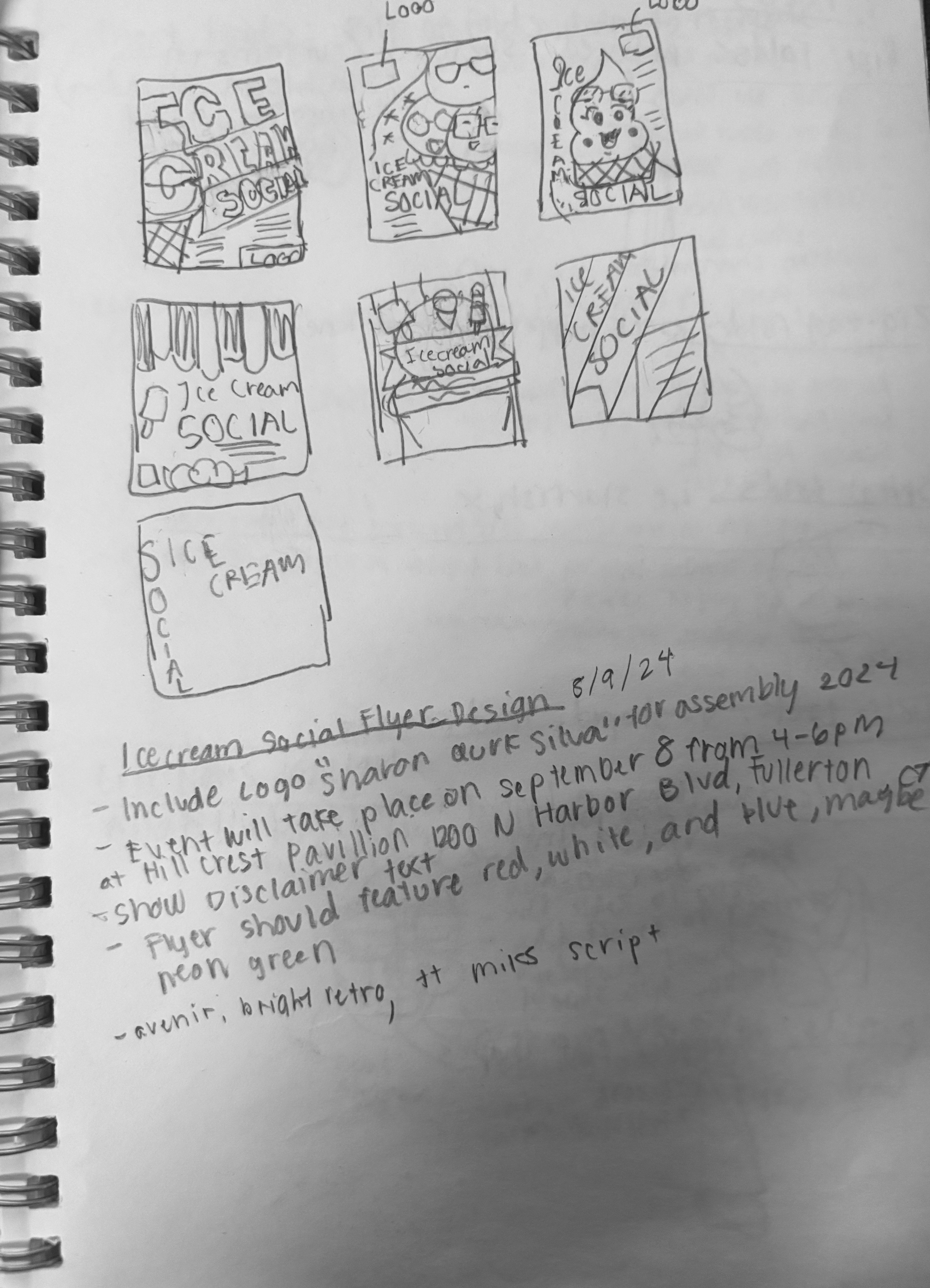
PROCESS: I began by reviewing the event details, campaign messaging, and target audience to determine how the information should be prioritized. I developed a layout that highlighted the event invitation, location, and purpose of the fundraiser while incorporating campaign branding elements and the candidate’s imagery. Typography, color, and hierarchy were carefully structured to ensure the flyer remained approachable and easy to read while still conveying the professionalism expected of a political campaign event.
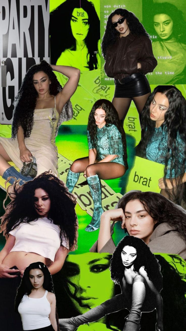
collage by Dea on Pinterest
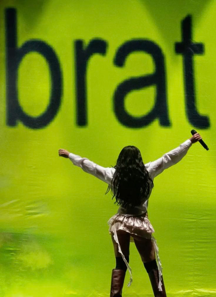
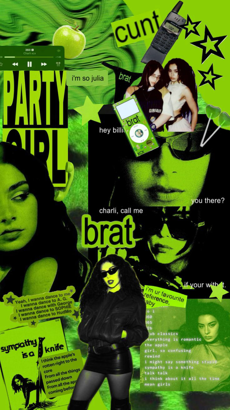
PROCESS: The client requested a design that would appeal to both younger and older audiences attending the event. To bridge this generational gap, I incorporated a vibrant green inspired by the “Brat green” color popularized by Charli XCX and her album Brat, giving the flyer a contemporary visual edge while still maintaining a clean and professional layout. I structured the flyer with a clear hierarchy highlighting the event invitation, fundraising purpose, and key details such as date and location. Typography and spacing were carefully balanced to ensure readability for a wide audience while keeping the design energetic and engaging.
DESIGN APPROACH:
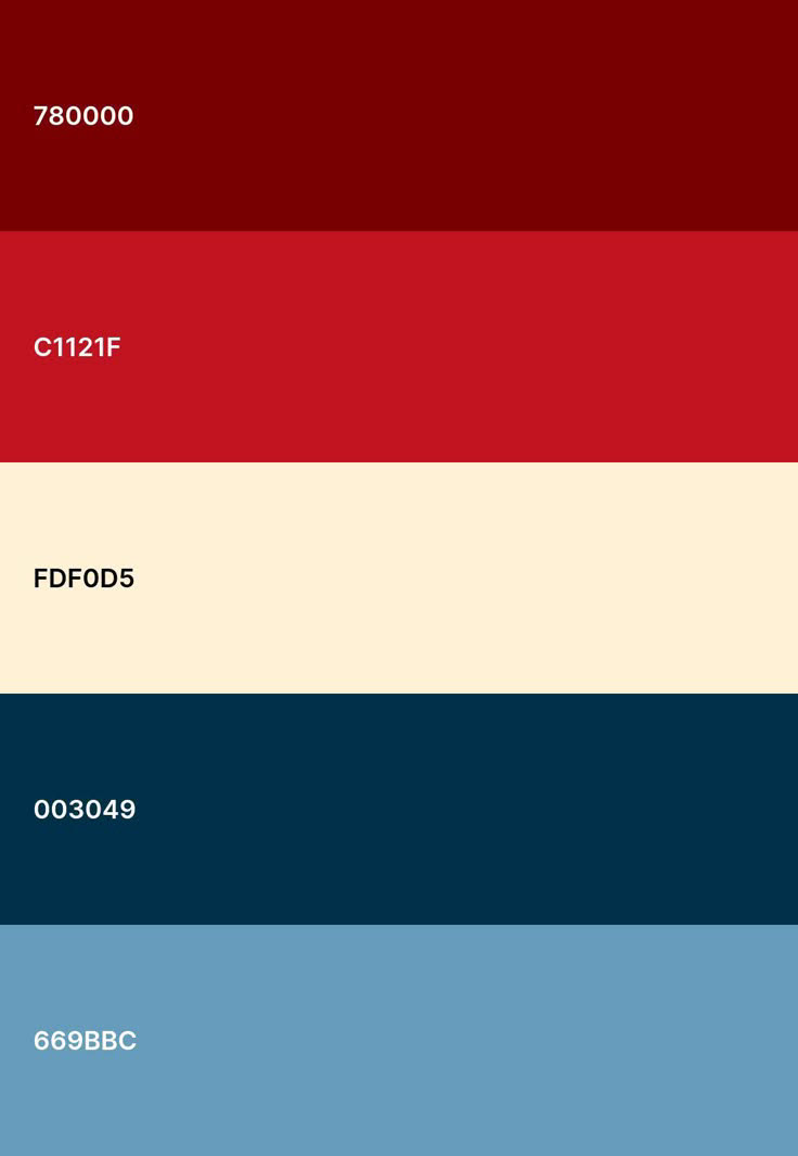
• Used a red, white, and blue color palette to reinforce credibility and civic trust
• Prioritized typography hierarchy to ensure key information (date, time, location) is immediately visible
• Structured layout for easy readability across different age groups
• Balanced imagery and text to maintain both professionalism and approachability
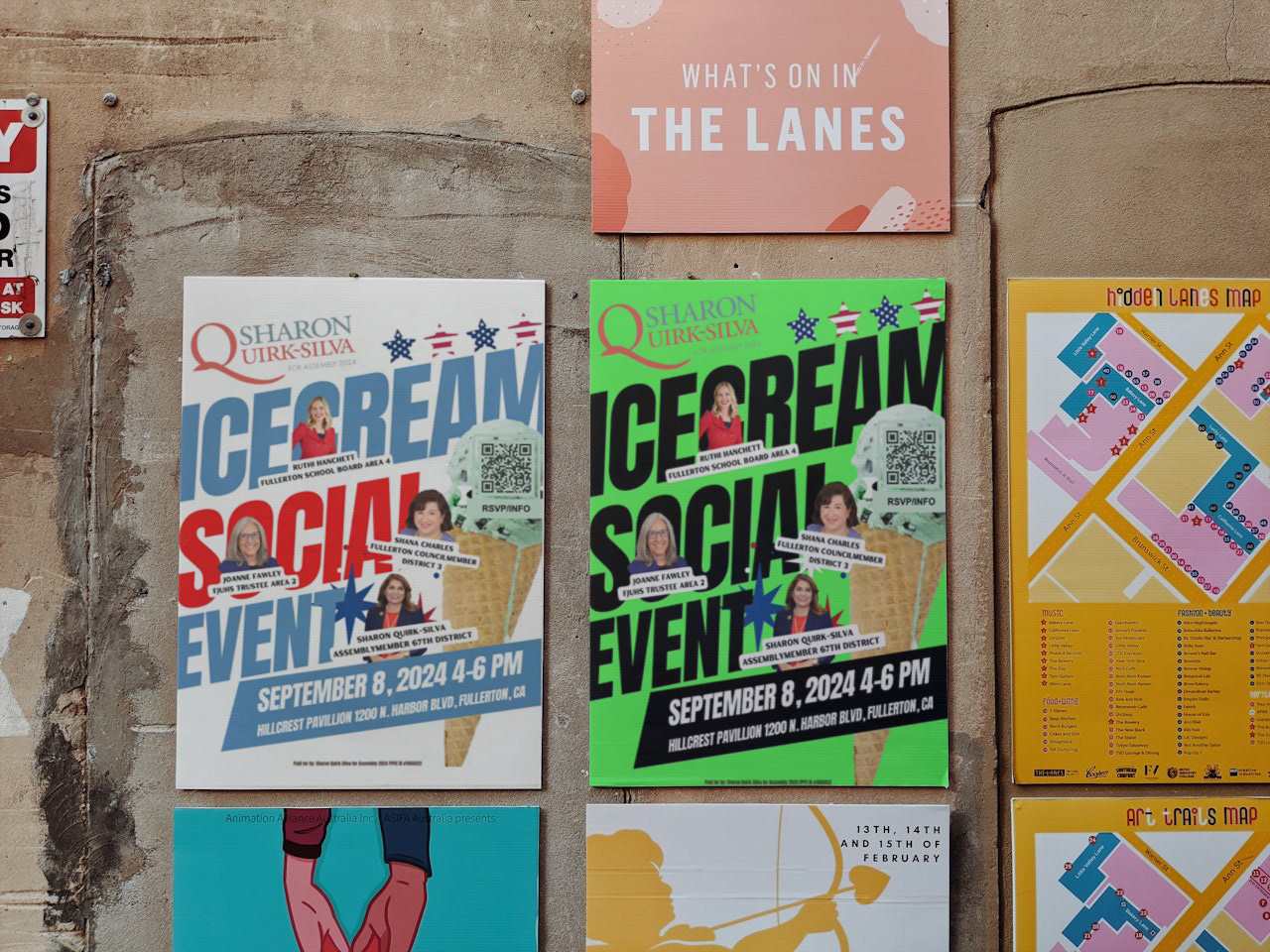
OUTCOME: Delivered a clean, accessible campaign piece that effectively communicated key messaging and supported community outreach efforts.
IMPACT:
• Designed to maximize readability across a broad demographic, including older audiences and first-time voters
• Prioritized key event details (date, time, location) to ensure quick comprehension in high-traffic environments
• Visual hierarchy and layout improved information retention and clarity
• Created a professional and trustworthy visual tone aligned with political campaign standards
• Adaptable design suitable for print distribution and digital sharing