
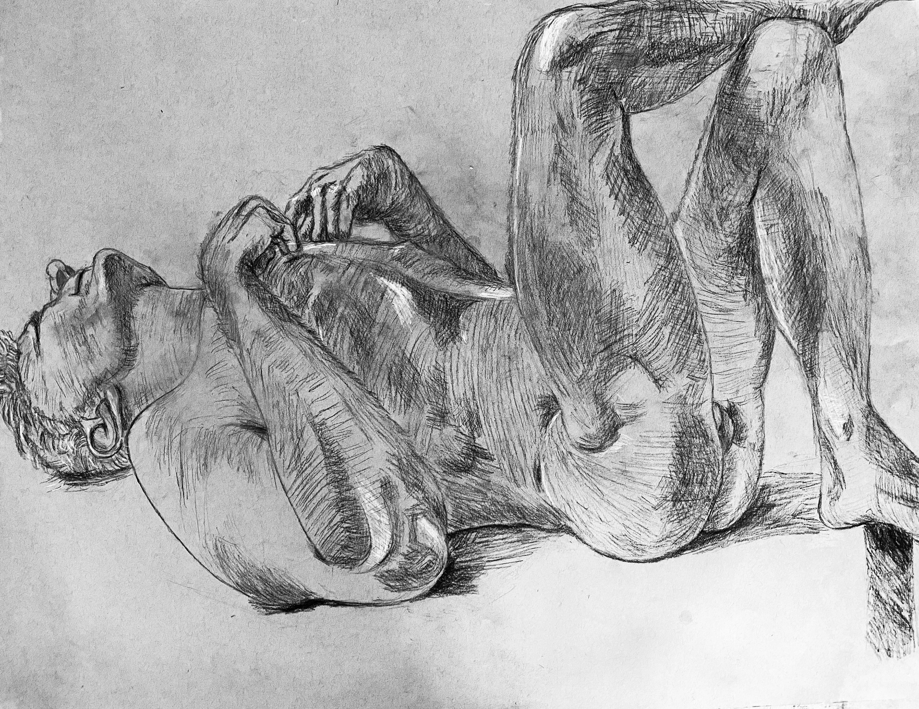
Paul Cadmus Master Copy, Charcoal on Grey toned 18” x 24” paper
OVERVIEW:
A collection of mixed media work combining printmaking techniques with digital illustration. This body of work explores how traditional processes and digital tools can work together to create visually rich, adaptable design.
MEDIUMS AND TECHNIQUES:
•Printmaking (relief, screen print, hand-rendered textures)
•Digital illustration and composition
•Texture layering and collage
APPROACH:
My process begins with hands-on experimentation using printmaking techniques to create organic textures and forms. These elements are then digitized and integrated with digital illustration, allowing for greater control, scalability, and flexibility across different formats.
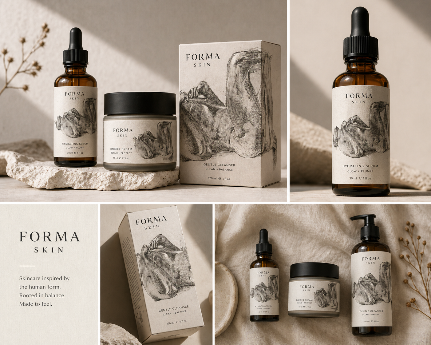
FORMA SKIN — Minimal Texture Concept
OVERVIEW:
FORMA SKIN is a skincare packaging concept that explores the relationship between the human form and minimal design. The visual identity combines hand-drawn figure studies with clean typography to create a refined, modern aesthetic.
CONCEPT:
This direction focuses on restraint and balance, using subtle linework and neutral tones to reflect the simplicity and sensitivity of skincare. The figure drawings act as a visual metaphor for skin itself—organic, imperfect, and human.
APPROACH:
Traditional drawing techniques were digitized and integrated into a minimal packaging system. The artwork is used sparingly to maintain a premium feel, allowing typography and negative space to carry the overall design.
OUTCOME:
The result is a cohesive, elevated packaging system that blends fine art with commercial design, demonstrating how handcrafted elements can enhance modern skincare branding.
APPLICATIONS:
•Editorial and publication design
•Branding and visual identity systems
•Packaging and product design
•Marketing and social media content
FOCUS:
•Contrast between organic and digital elements
•Strong composition and visual balance
•Texture as a key storytelling element
•Cohesive color systems across mixed mediums
PURPOSE:
This work highlights my ability to bridge traditional and digital practices, creating visuals that feel both expressive and commercially applicable.
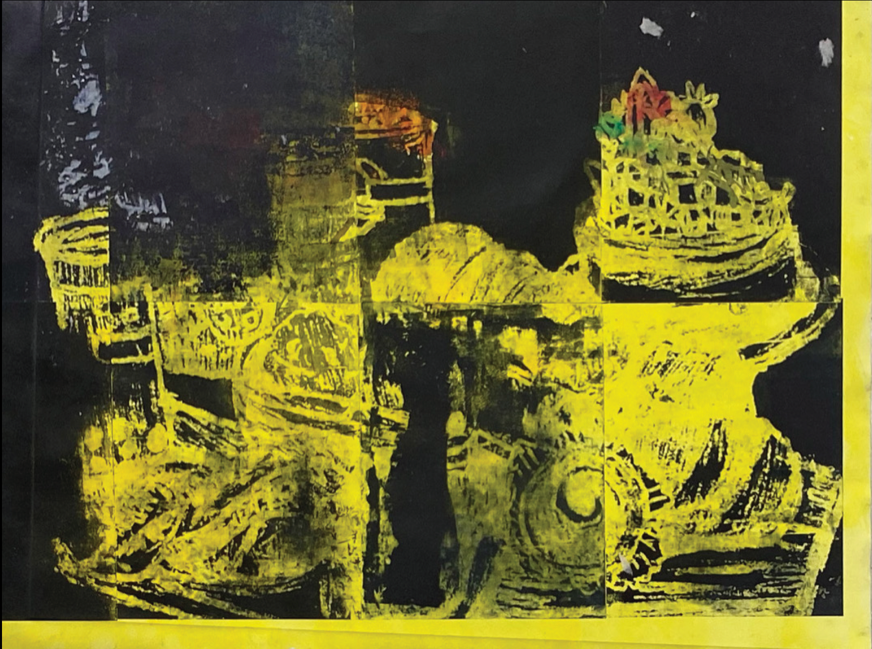
Untitled, Monoprint 16"x24"
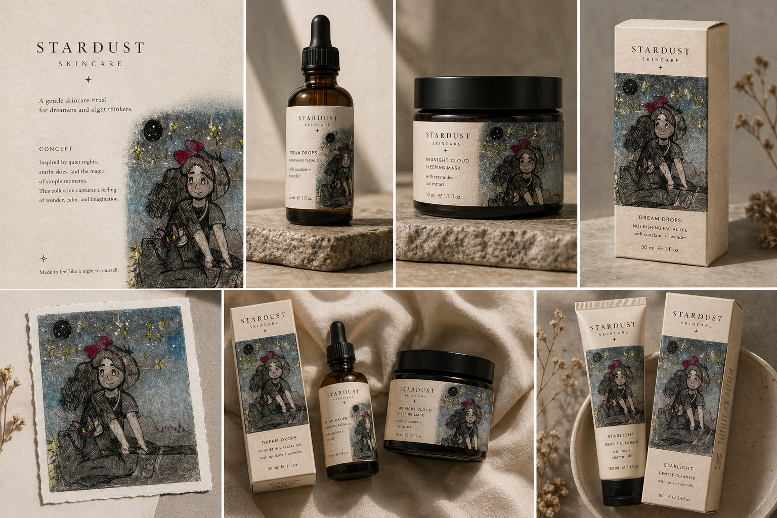
FORMA SKIN — Printmaking Texture Concept
OVERVIEW:
This packaging concept explores a more expressive direction for FORMA SKIN, incorporating bold printmaking textures to create a high-contrast, visually striking identity.
CONCEPT:
Rooted in the contrast between raw texture and refined skincare, this direction uses layered printmaking elements to represent depth, transformation, and the tactile nature of skin.
APPROACH:
Original printmaking artwork was digitized and reworked into a modular visual system. The textures are applied strategically across packaging to create consistency while allowing for variation within the product line.
OUTCOME:
This concept demonstrates a more experimental approach to beauty branding, showing how traditional print techniques can be adapted into contemporary, commercially viable packaging.
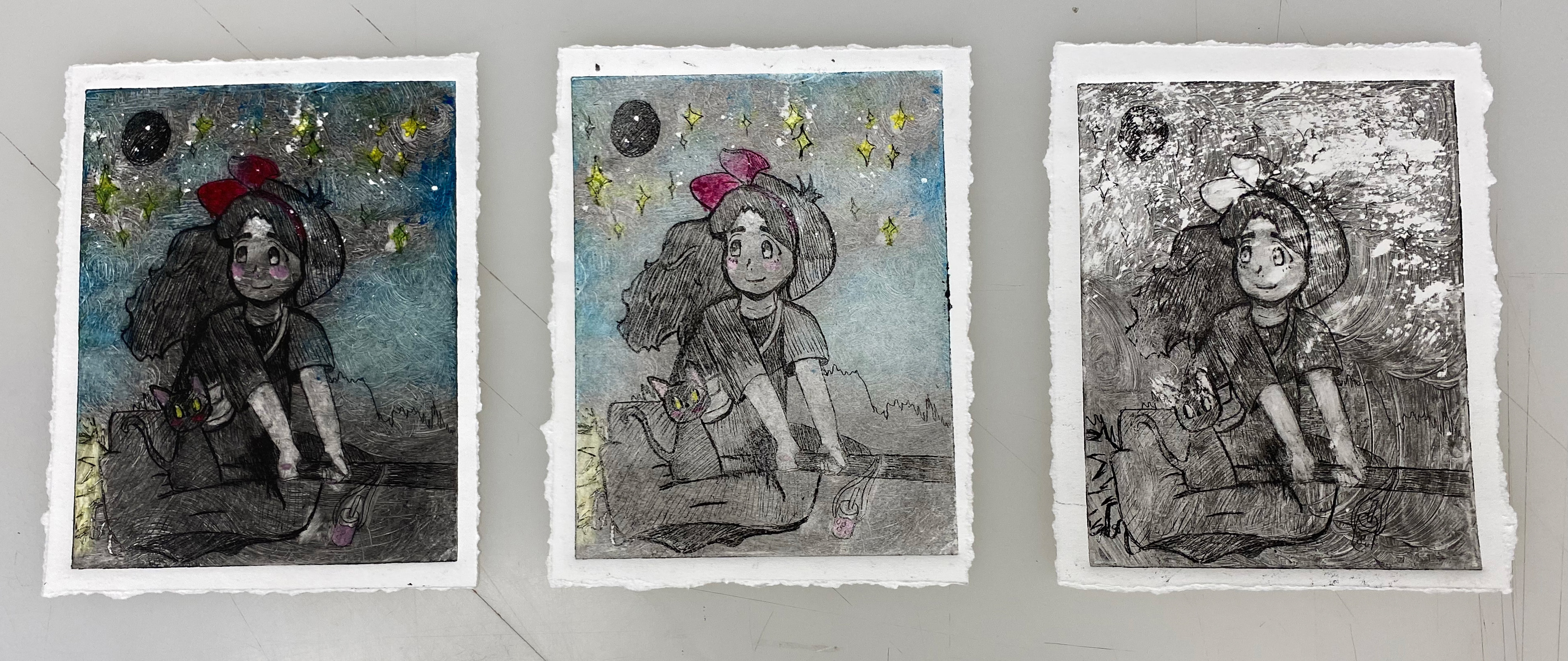
Kiki's Boba Delivery Service, Etching on Copper Plate, Printmaking
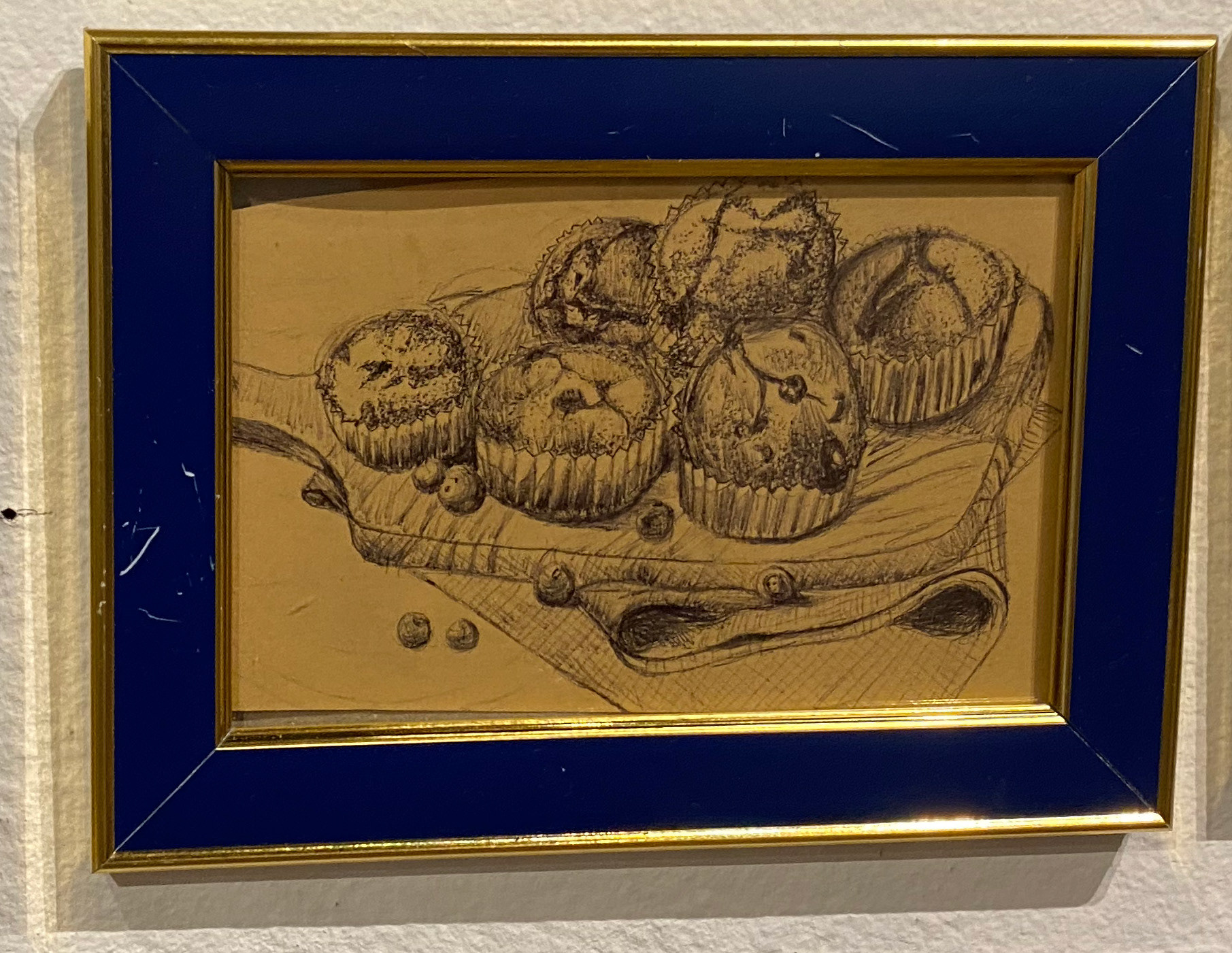
Muffins, Ink on toned tan paper
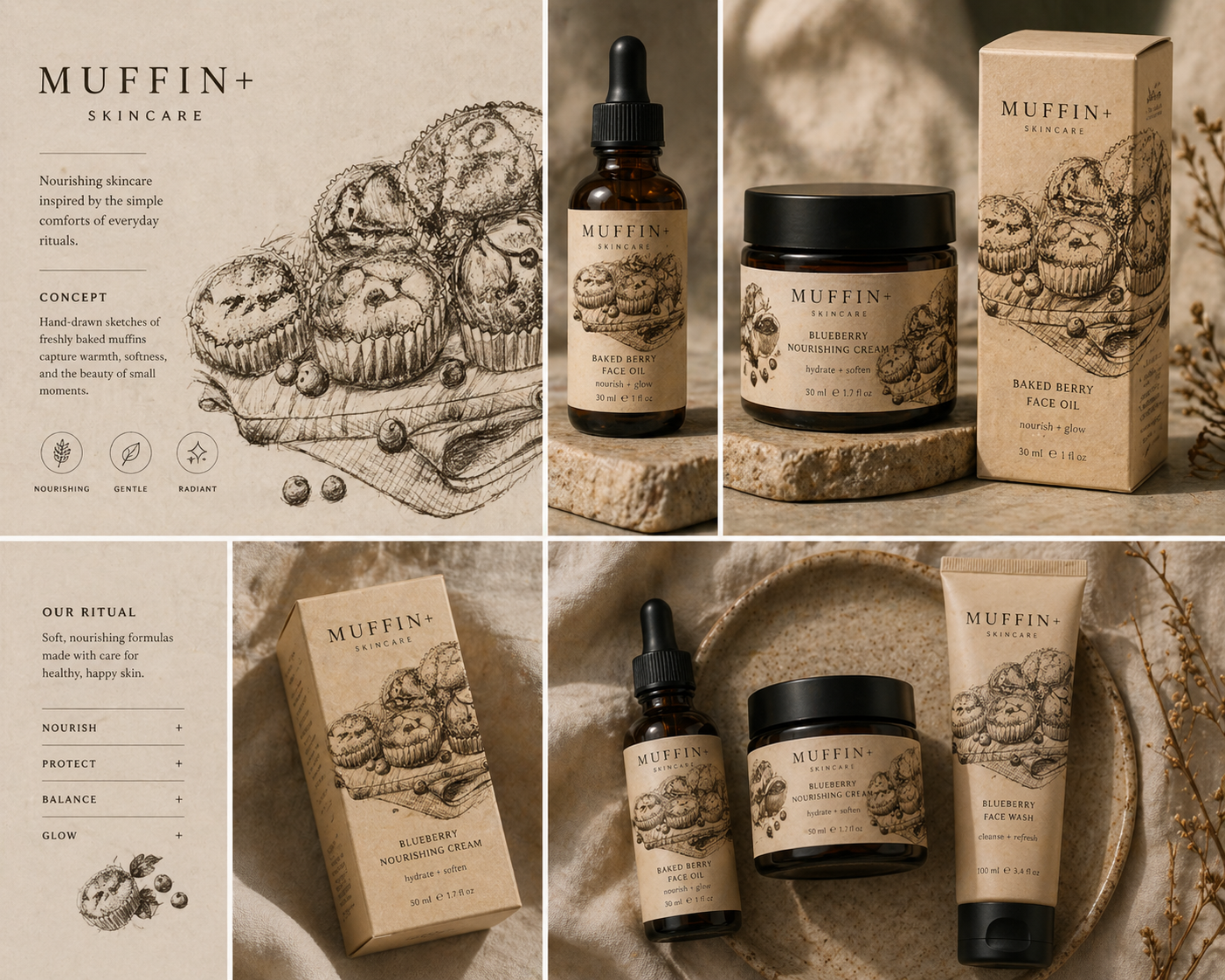
🧁 MUFFIN+ SKINCARE — Comfort Ritual Concept
OVERVIEW:
MUFFIN+ is a skincare packaging concept inspired by everyday comfort and warmth. The visual identity draws from hand-drawn food illustrations to create a soft, nostalgic aesthetic that feels more human and relatable.
CONCEPT:
This direction explores the connection between skincare and daily rituals—similar to the comfort of baking or sharing food. The muffin illustrations symbolize care, nourishment, and simplicity, translating those qualities into a skincare experience.
APPROACH:
Hand-drawn sketches were used as the foundation of the visual system, emphasizing texture and imperfection. These illustrations were digitized and applied across packaging to create a cohesive, tactile identity that feels both crafted and accessible.
OUTCOME:
The final result is a warm, inviting packaging system that stands apart from traditional beauty branding by embracing familiarity and emotional connection, while remaining commercially adaptable on many platforms.
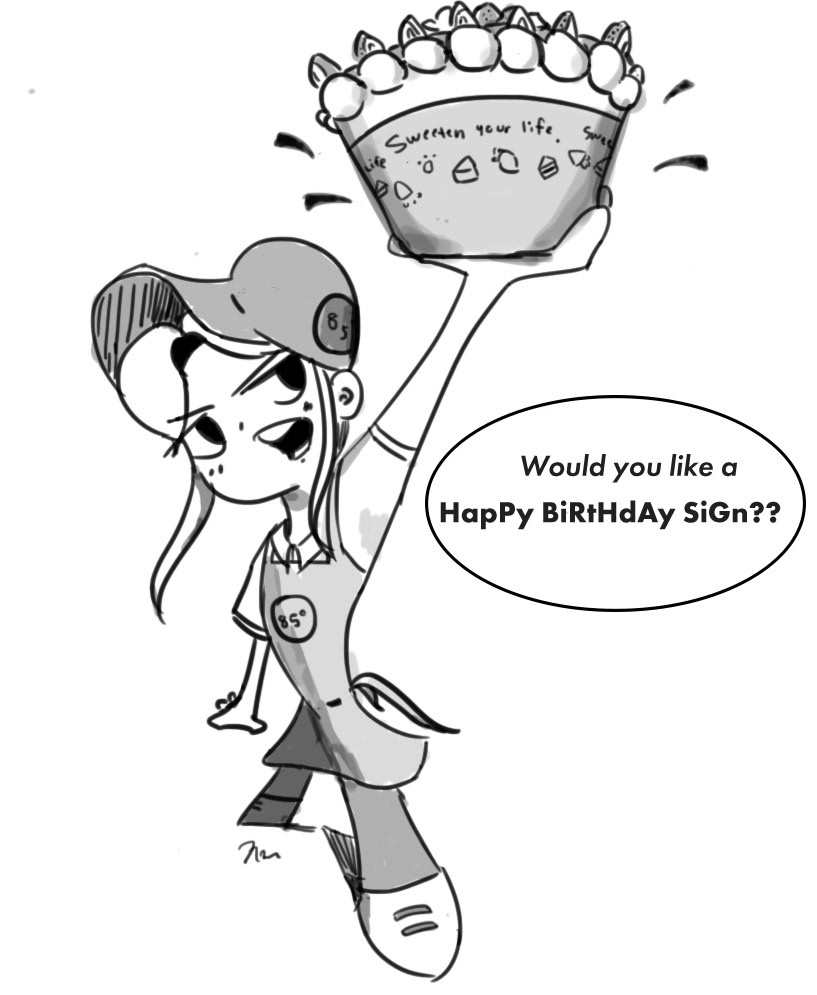
Would you like a happy birthday sign?, Digital Drawing
🍰 85° Bakery — Illustration-Driven Branding Concept
OVERVIEW:
This project explores an illustration-led branding direction for a bakery concept inspired by 85°C Bakery Cafe. The goal was to create a playful and cohesive visual identity that enhances the experience through character-driven design.
CONCEPT:
The concept centers around warmth, personality, and everyday interaction. A custom illustrated character acts as the face of the brand, bringing a sense of friendliness and storytelling to the bakery experience.
The phrase “Sweeten your life” reinforces the emotional connection between the product and the customer, positioning the brand as both comforting and memorable.
APPROACH:
Developed a hand-drawn character to serve as a recognizable brand mascot
Combined illustration with clean, minimal layouts to maintain clarity and usability
Applied the visual system consistently across packaging, signage, and merchandise
Used a soft, warm color palette to reflect the inviting nature of a bakery environment
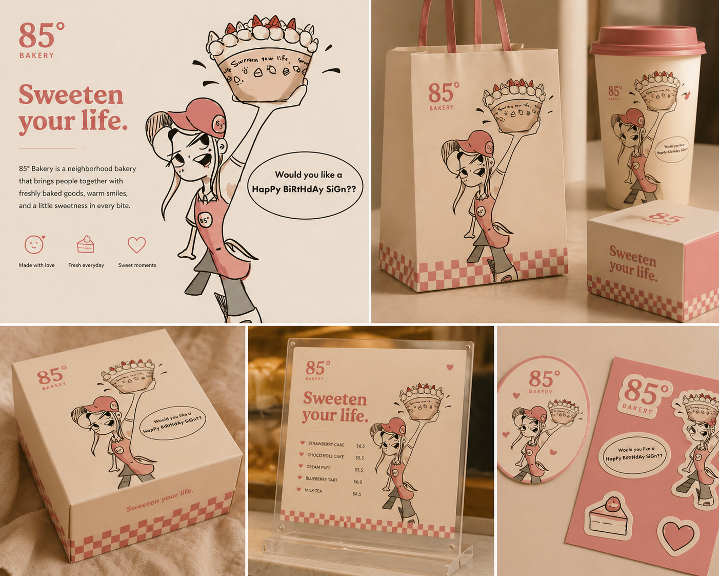
APPLICATIONS:
To-go packaging (bags, boxes, cups)
In-store signage and menu displays
Branded merchandise and stickers
Marketing materials and promotional graphics
OUTCOME:
The result is a cohesive and engaging brand identity that uses illustration to create a memorable and approachable customer experience, demonstrating how character-driven design can strengthen brand recognition and emotional connection. This project highlights the ability to translate illustration into a scalable brand system that functions across touchpoints.