
Curacao Refer A Friend Logo Redesign
CLIENT: Curacao
ROLE: Graphic Designer, Illustrator
PROJECT OVERVIEW: Redesigned the logo for Curacao’s “Refer-a-Friend” program to create a more modern, cohesive visual identity that aligns with the brand while increasing visibility and engagement across marketing materials.
OBJECTIVE: Develop a logo that clearly communicates the concept of sharing and rewards, while maintaining consistency with Curacao’s existing brand identity and appealing to a broad customer base.
BACKGROUND: As part of an internal branding initiative at Curacao, I was tasked with redesigning the existing “Refer a Friend” logo to better align with the company’s updated visual identity and customer-first values. The project focused on reimagining the logo to feel more approachable, friendly, and emotionally engaging, reflecting Curacao’s emphasis on building genuine relationships with its customers. I developed a refreshed visual direction that prioritizes warmth, trust, and connection—reinforcing the idea of treating customers with respect and like family. The final design integrates cohesive branding elements and a modern aesthetic to create a more inviting and relatable experience
PROCESS: I began by evaluating the existing “Refer a Friend” logo and researching Curacao’s updated branding guidelines to understand the desired visual direction and tone. From there, I explored concepts centered around connection, trust, and community to reflect the company’s relationship-driven approach. I developed multiple logo iterations, focusing on approachable shapes, friendly typography, and cohesive visual elements that align with the broader brand identity. After narrowing down the strongest concepts, I refined the design through feedback and iteration, ensuring clarity, scalability, and consistency across applications. The final step involved polishing the logo and preparing it for implementation across digital and print touchpoints, resulting in a warm and engaging visual that reinforces Curacao’s family-oriented values.
PROBLEM:
The existing logo lacked visual clarity and brand cohesion, making it less effective in communicating the value of the referral program. It also did not stand out across digital and in-store marketing materials.
DESIGN APPROACH:
•Created a clean, recognizable mark that visually represents referral and reward through simplified iconography
•Focused on legibility and scalability to ensure the logo performs across multiple formats (mobile, web, print)
•Aligned color palette and typography with Curacao’s brand to maintain consistency
•Simplified the overall design to improve recognition and quick comprehension
•Designed with versatility in mind, allowing the logo to function as both a standalone mark and within promotional layouts
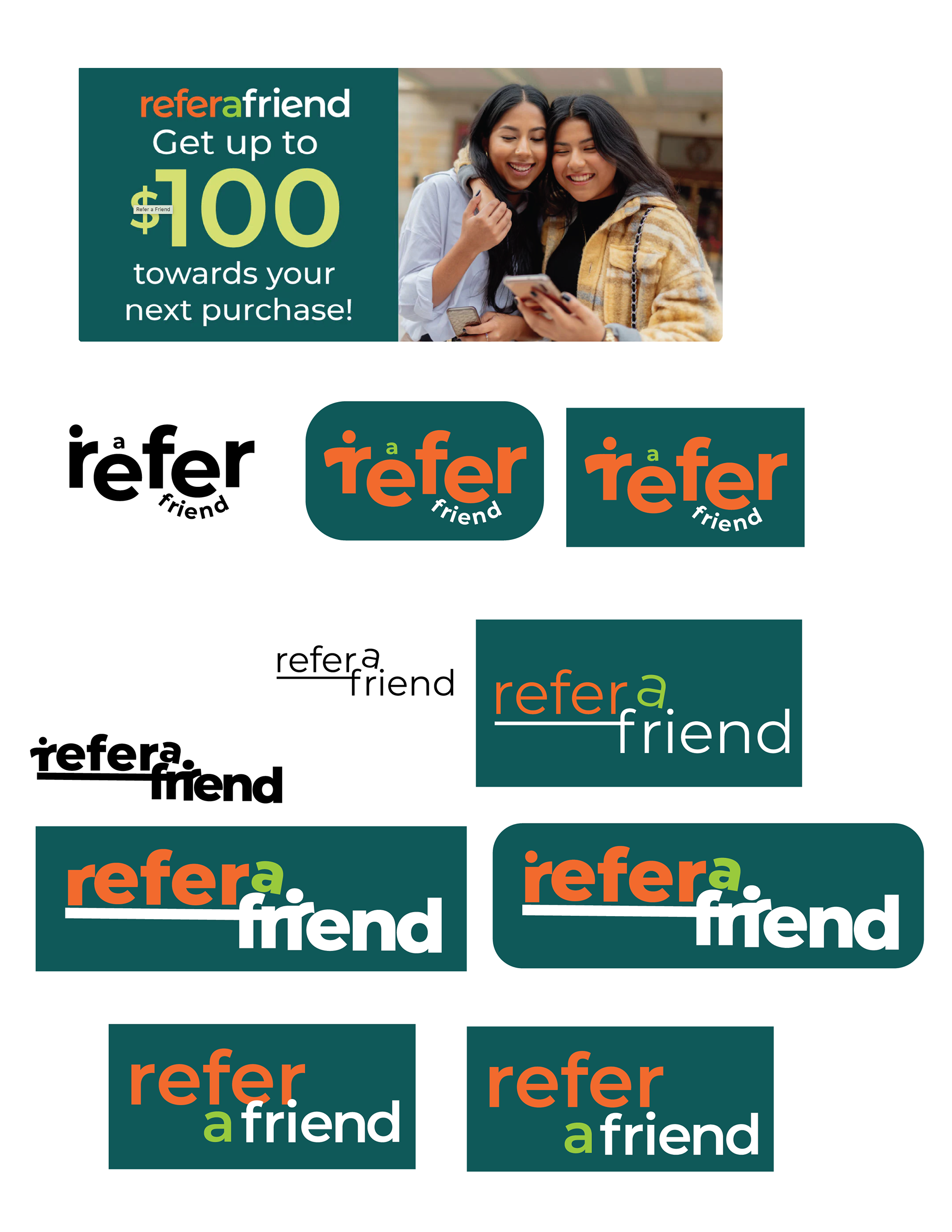
old logo on top and different versions of new logo ( process )
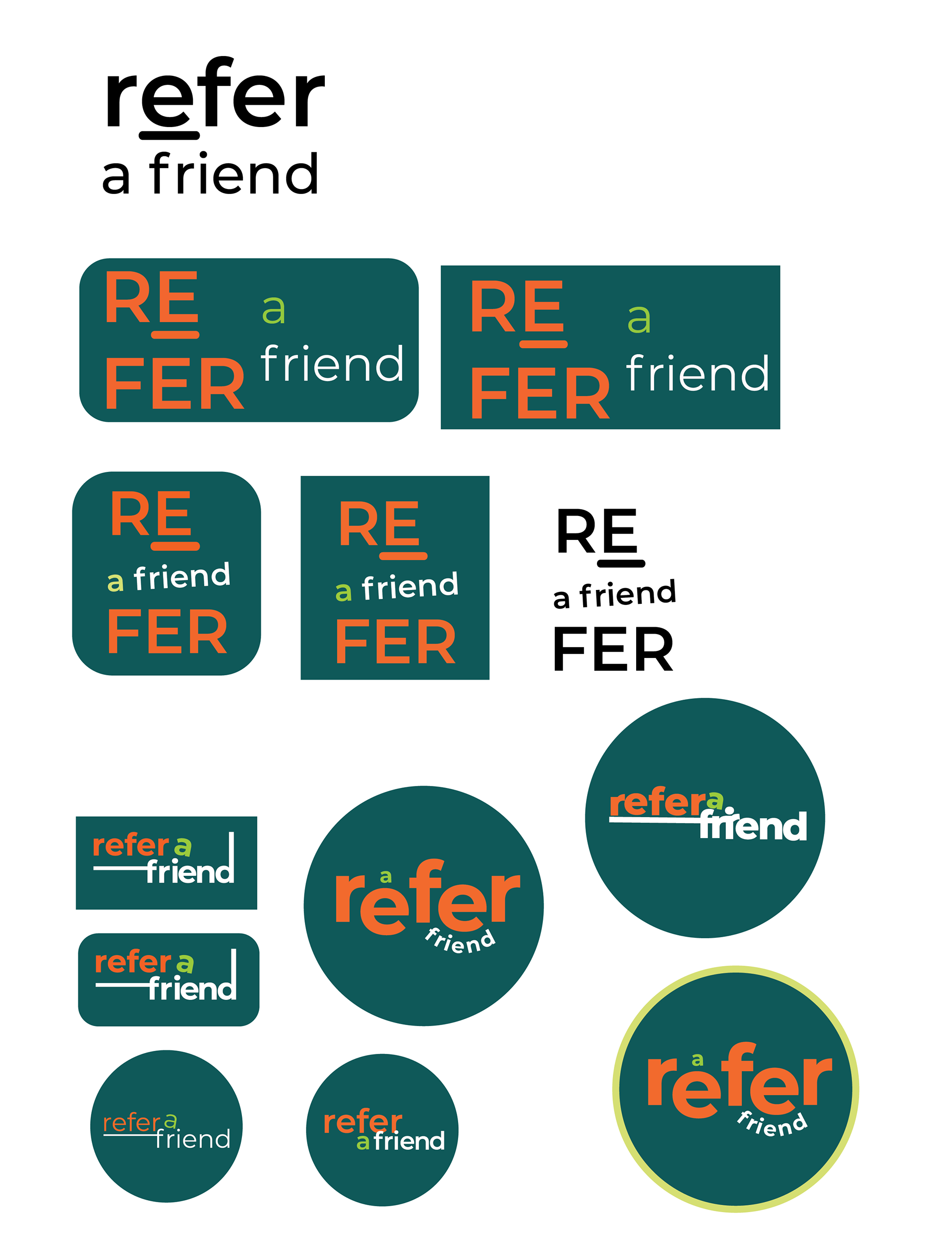
*Process*

*Process*

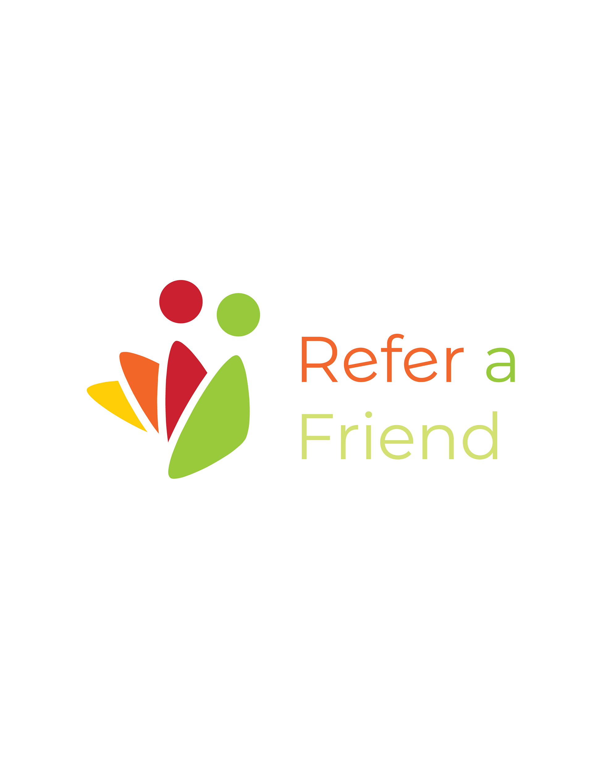
Logo Redesign Final Version
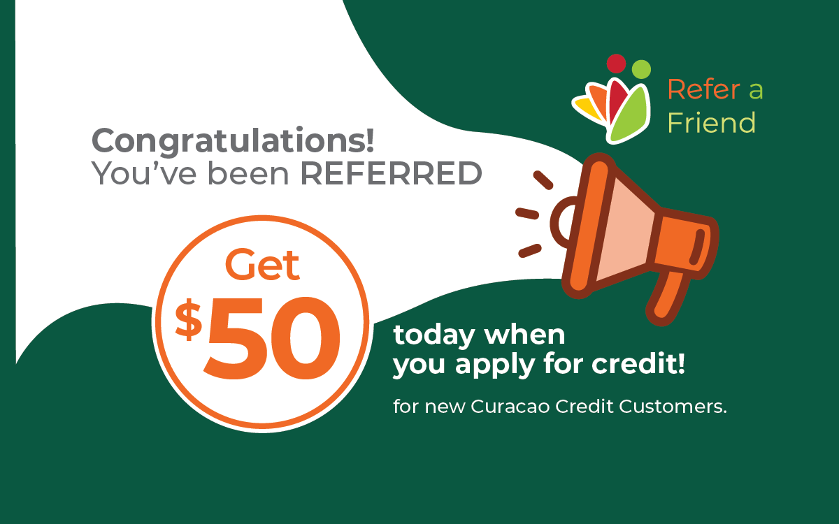
Write Along for being Referred
Impact
•Improved visual consistency across referral program marketing materials
•Increased clarity of the program’s purpose through stronger visual communication
•Enhanced logo scalability and usability across multiple platforms
•Created a more recognizable and cohesive identity aligned with Curacao’s brand
Applications
•Mobile app banner
•Email marketing header
•In-store promotional signage
•Social media graphics